Typically, people visit hospitals when they’re most in need. But when they get there, it can be difficult to find their way around. The facilities are often enormous, the long corridors can be disorientating, and different departments can have complicated or unfamiliar names.
The importance of patient experience shouldn’t be underestimated, and effective hospital wayfinding signage plays an important role in improving that experience for everyone. It can reduce patient stress, save time for staff, and make a hospital a more welcoming place.
In this guide, we make the case for using digital wayfinding signage in hospitals. Not only is it visually striking and easy to follow for hospital visitors, but it can offer a lot more than just wayfinding too.
Read on to find out why digital is the future of hospital wayfinding signage and how you can get started with Yodeck.
Why You Need Hospital Wayfinding Signage
While patients might take it for granted, effective wayfinding signage is a must for every hospital and medical center.
It’s not just about helping people get from A to B. Rather, in an often intimidating place, it helps to ensure that everyone’s experience is as smooth as it can be.
- It can reduce patient stress. Research shows that as many as one in five hospital visitors would describe themselves as worried. Getting lost or feeling like they’re late for an appointment will only compound those negative feelings. On the flip side, effective wayfinding helps everyone reach their destination as easily as possible.
- It can save staff time. Patients who get lost can be late for their appointments, throwing off the schedule for everyone. What’s more, they’re likely to interrupt staff to ask for directions if they can’t find their way. Effective signage can help to save time in both regards.
- It ensures everyone can use the hospital facilities. People with disabilities, reduced mobility, or visual impairment are likely to be using the hospital. Wayfinding signage makes sure that they can get around too.
How to make effective hospital wayfinding signage
Creating effective hospital wayfinding signage with conventional signage systems is not always as easy as it might seem.
For example, in the UK, the official guidance for wayfinding in hospitals runs to over 140 pages—and there’s no doubt that other places have similar levels of regulatory detail too.
While we won’t explore this in so much detail here, let’s talk through three lessons that you should bear in mind with your signage.
1. Remember wayfinding is a whole process—not just signage
Hospital staff and visitors have already started wayfinding before they enter the healthcare facilities and see any signs. If someone has never been to the site before, they’ve likely looked up where they need to go and made some decisions about how to get there.
That’s why wayfinding is often referred to as a process, and one that’s affected by a whole range of different factors and decisions. Your signs should make sense in the context of this whole process.
What does that mean in practice?
Well, for example, did your hospital send out letters to tell patients about their appointment? The signs you use in the hospital environment should be consistent with the language that was used in those letters.
Similarly, consider that patients are already having to process lots of information on their wayfinding journey. They’re moving quickly—and they may be confused if there are lots of irrelevant details or if the information is not clear.

2. Make the visuals clear and compliant
Effective wayfinding signage should be as clear as possible. All the information should be presented in a way that’s legible to everyone.
There are some simple things that you can keep in mind here.
- Your sign’s writing should be as readable as possible. For example, it could use
- sans serif fonts
- white writing on a dark background, or vice versa
- bold typeface to improve contrast.
- Different signs have different viewing distances. For example, a map will be looked at closely, while a suspended sign in a corridor will be seen from further away. The size of the text should reflect this.
- Information should be grouped appropriately. For example, different clinics within a hospital might be grouped together on the same sign. However, randomly grouping unrelated destinations (like toilets, dermatology, way out, orthopedics) on the same sign can be confusing. It can help to organize different groups into different colors too.
- Use consistent language throughout. While many people might know that a pediatrician treats children and an ophthalmologist is an eye doctor, not everyone does. Consistent language makes sure everyone knows what they’re looking for at all times.
Of course, every hospital is different, with different layouts and different signage needs. But the ultimate aim is to create signage that’s as clear as possible for everyone. People with visual impairments, for example, need to be able to get around as much as anyone else.
3. Help visitors leave the site too
As we said above, wayfinding is not simply about helping people find their way from A to B on the hospital premises. Visitors need to reach the site—and leave—easily too.
That means that it’s worth including extra information on your hospital signage that can improve the experience of your patients overall. For example, signs can help them to find their way to bus stops or provide live public transit information.
How digital signage makes hospital wayfinding easier
Healthcare digital signage is the general name for a range of different types of displays powered by technology. They can do what conventional static signage can do, but better:
- It’s bright, clear, and attention-grabbing. Thanks to its appealing visuals, digital signage is easier for your visitors to follow.
- It saves on physical signage and marketing materials. By going digital, you’ll be reducing waste and your carbon footprint.
- It can be centrally updated. Control all the content you need from a single central location.
- It further reduces patient stress and perceived wait times. By hosting a range of different content, you can keep patients and visitors entertained and informed while reducing frustration.
But digital wayfinding signage is not limited to simply giving directions. It can do a whole lot more too.
In fact, with Yodeck, your digital signage can do anything you need it to. Simply select content—image slideshows, video, or live information from the internet—and add it into a playlist. Then, you’re ready to go.
Here are some things you can do with Yodeck.
What can hospitals do with Yodeck’s digital signage
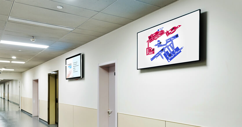
- Help visitors and patients navigate the hospital. Yodeck’s digital signage takes you beyond simple directions. For example, use your wayfinding to display maps and even interactive route planning.
- Host public transport information. Want to show patients when the next bus is coming? With Yodeck, that’s easy. All you have to do is add a transit app to your playlist and people will see the timetable in real time.
- Communicate alerts and emergency notifications. Digital signs can give important updates throughout the hospital facility, such as security alerts or emergencies. It can help keep your visitors safe.
- Display staff notices and patient wait times. Is a staff member needed in a particular ward? Use your screens to make that known. Meanwhile, your patients will likely have to wait to be seen by a doctor. Clearly displaying how long they should expect that wait to be can set expectations early and reduce frustration.
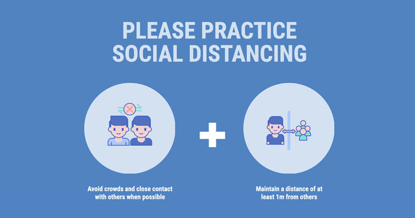
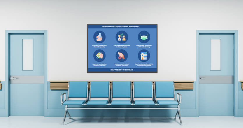
- Remind people of hygiene guidelines. Whether it’s Covid-19 regulations or general hygiene, using digital signage to highlight the behaviour you expect on-site will help get the message across and increase compliance.

In research from Yodeck, we found that showing Covid-19 information on digital signs resulted in a 28% jump in compliance. It’s definitely worth doing.
With Yodeck’s digital signage, you can easily share other information too. Whether that’s welcome information or wellness tips, legal changes or local news, you can host anything you want on your digital signs.
How Yodeck makes hospital signage easier
At Yodeck, we’re committed to making digital signage simple for everyone. With affordable options and easy setup, you can get started today.
- Build incredible visuals in moments. With our range of templates and apps, you can build visually stunning signage in moments. Simply sign up for free and explore your options.
- Plug and play functionality. When you’re ready to use your signage, all you need is a Yodeck media player to get started. It’s ready to work straight out of the box.
- Affordable and scalable. Your first screen will be free, and then you can scale to as many as your hospital needs.
Ready to give it a try?
