The world of digital signage design can feel daunting at first. There’s a lot to consider, from technical set-up to message scheduling, brand guidelines, and creating designs that work well on screen. But at Yodeck, we’re on a mission to make digital signage simple, fast, and hassle-free.
With just a few basic principles and digital signage tips, you’ll be well on your way to creating beautiful, clear and engaging content. In this guide, we share 7 essential digital signage tips and how to choose the best digital signage provider for your needs.
Let’s get started.
Digital Signage Design: 7 Essential Tips
Designing digital signage content is a lot like designing for other digital media or print.
Whatever format you’re thinking about, great design revolves around the fundamental principles of simplicity, responsiveness to your audience, clarity, and creativity.
Even so, there are a few important differences to bear in mind when you’re creating digital signage. You need to consider things like technical specifications, message scheduling, color contrast, and the best layouts for your screens.
We’ve already created a more in-depth guide to designing attractive digital signage advertising, so take a look at this. But to get to grips with basic design principles, here are 7 top tips to bear in mind.
1. Typography and Colour: Clarity and Simplicity
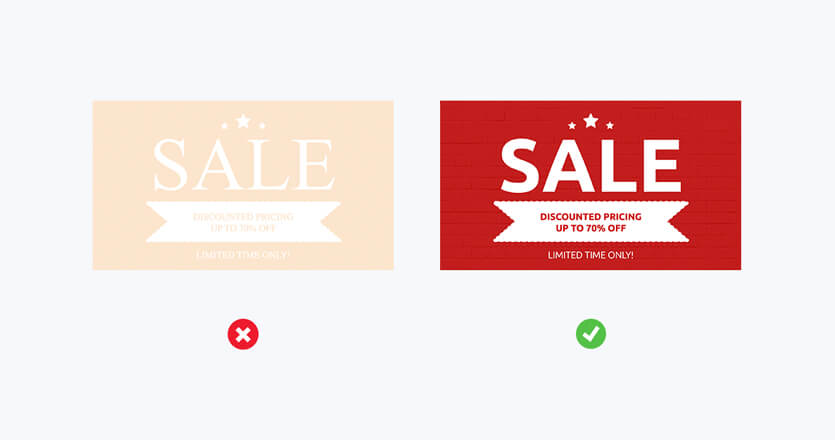
If someone can’t separate your words from your background imagery, your message is lost. It’s as simple as that.
So, what’s the best way to avoid this?
Use light text on dark backgrounds (and vice versa) and don’t try to pack your design with too much text. This will let you keep the font size as large as possible and improve readability.On the theme of clarity and simplicity, don’t use more than two font types and avoid serif fonts. Sans serif options (like calibri, arial and helvetica) are easier to read. Treat color schemes in the same way, and don’t use too many colors at the same time.
2. Remember Resolutions, Ratios, and “Safe Areas”
As well as simple and clear messaging, it’s also vital to remember a few technical principles of digital design.
This includes “safe areas” (i.e., leaving a buffer of open space around the edge of your design elements, so important messages don’t disappear off-screen) as well as knowing the resolution and aspect ratio of your digital signage screens.
What do we mean by this?
Well, an “aspect ratio” is just the width and height of your screen. Today’s wide-screen TVs almost always have an aspect ratio of 16:9. If your TV is in a portrait position, it will be 9:16.
Whatever aspect ratio you’re working with, your content must be designed in the same ratio. You should also make sure images are high quality, so they don’t look blurry with your screen resolution (i.e., how many pixels are on your screen). This is especially important if you’re working with high definition screens.
In good news, this is easy to check. Just play around with file sizes and look at your designs (checking for any fuzziness) when they’re on screen. That’s it!
3. Make the Most of Message Scheduling and Duration
With Yodeck, you can schedule content in advance. This means you can rotate your designs and messaging as much or as little as you please, to suit your target market.
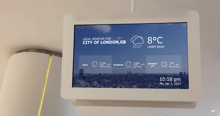
If you’re creating signage for high footfall areas (like a storefront), you can change your digital content regularly (say 10 messages changing every 5 seconds). If you keep all your designs on brand with some common elements (for instance logos, colours, or weather apps), you’ll also avoid the potential for over-stimulation.
If you’re designing for a static audience (for example, in a medical waiting room), it’s better to keep your message duration longer. This should be at least 12 seconds, so your target group doesn’t feel bombarded.

4. Don’t Forget “Dwell Time” and Playlist Loops
Related to message scheduling, think carefully about how long people will be sharing a space with your digital signage.
If they’re in one area for a long time (over an hour), it’s better to opt for a more extended playlist (perhaps with two 30-minute playlists on rotation). This means people won’t get sick of your content. If you’ve ever worked in hospitality, with the same songs playing on a short loop, day-after-day… you’ll know the importance of this! On the other hand, if you’re designing for a quick “dwell time” space (like a train station concourse), then a short playlist of just 30 seconds will do the trick.
5. Make Previewing a Priority
This is a big one. We’ve already mentioned how checking your image quality is important, but it’s vital to consider your design as a whole.
Think about where your eyes go first. Are you highlighting your most important messaging appropriately?
Put yourself in the position of your audience and stand back at least a couple of metres from your screens. Is your design and messaging still clear and easy to read?
Don’t forget to check your sound levels too. If you’re playing any music, rolling news, YouTube, or social media feeds, it’s got to be an appropriate volume for your environment.
Audio is a great way to engage people in busier general public areas. But it’s a fine line to tread. If you’re designing for quiet spaces like libraries or offices, this might get annoying. As always, consider your target audience and focus on actively improving customer experience with your digital designs.
6. Understand any Relevant Safety Regulations
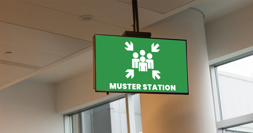
Digital signage helps keep visitors and employees safe. There are many types of safety signage, from evacuation procedures in schools and universities to signs communicating critical information on manufacturing and construction sites.
If you’re designing with Health and Safety Regulations in mind, you need to know what signs are required and where. Official UK regulations state signs must be clear, legible, and properly maintained. The illumination and size should also be “appropriate” for the viewing distance, avoiding any potential confusion.Keeping these design principles in mind will massively help with this. Find more information on Wayfinding Signage Regulations and Health and Safety Regulations on government websites in the UK. If you’re based elsewhere, you’ll need to check local requirements.

7. Include a Strong Call to Action (CTA)
Ask yourself why you’re creating and displaying your digital signage in the first place.
What are your goals?
While the answer will be different for everyone, it’s normally because you want your target audience or customers to act in some way. This could be a consumer purchase in-store, sign-ups to a library newsletter, or keeping people safe in the event of an emergency.

Whatever it is, a powerful call to action is essential. Just like all digital signage, this needs to be clear and concise. Any viewers glancing at your displays should easily understand your message and know what action you want them to take.
Not sure what works? Experiment!
The wonderful thing about digital signage is it’s easy to update. It’s a good idea to try different words and CTAs (learn more, discover more, sign up, visit now… etc.) and track their effectiveness over time.
Ask yourself why you’re creating and displaying your digital signage in the first place.
What are your goals?
While the answer will be different for everyone, it’s normally because you want your target audience or customers to act in some way. This could be a consumer purchase in-store, sign-ups to a library newsletter, or keeping people safe in the event of an emergency.
Whatever it is, a powerful call to action is essential. Just like all digital signage, this needs to be clear and concise. Any viewers glancing at your displays should easily understand your message and know what action you want them to take.
Not sure what works? Experiment!
The wonderful thing about digital signage is it’s easy to update. It’s a good idea to try different words and CTAs (learn more, discover more, sign up, visit now… etc.) and track their effectiveness over time.
How to Choose the Best Digital Signage Provider
Of course, these tips are difficult to implement if you don’t have the best digital signage software at your fingertips.
To choose the best digital signage provider, use the advice above as a checklist. Ask yourself, can your provider help you make the most of all these essential tips?
If they do, great!
After this, it’s time to start thinking about ease of use (both in terms of design and technical set-up), price and scalability.
Here are a few questions to ask:
- Does the digital signage software meet all my requirements?
- Is this software easy to use? Does it let me update my content quickly and effortlessly?
- Are design templates fully customizable, so I can optimize content for my company brand guidelines?
- Can I schedule content in advance and manage screens remotely?
- How much does it cost? Does this work for my budget?
- Is the technology secure and reliable?
- How straightforward is the technical setup?
At Yodeck we offer unbeatably easy digital signage. With these questions in mind, here are just a few reasons why we’re a great choice:
- Easy updates. With our cloud-based digital signage platform, you can create, update and schedule digital signs from anywhere.
- Simple to use. You’ll find hundreds of apps and layouts (with free stock image and video galleries), so you can display interesting and useful content in seconds.
- Adaptability and customisation. Our free design templates are fully customizable, so your designs perfectly fit your organization’s branding guidelines.
- Scheduling and screen management. With Yodeck, it’s easy to set content schedules in advance and manage just one (or thousands!) of screens from your laptop.
- Competitive pricing. If you’re getting started with a single screen, you can sign-up for a completely free Yodeck account. After this, our digital signage solutions start at $7.99 a month. Enterprise options (best for large organizations with complex security needs) rise to just $12.99.
- Security. Our enterprise-grade security includes full firewall and password policies, player lock-down and storage encryption features. You’ll know your digital signage is in safe hands.
- Straightforward set-up. With our dependable Plug & Play Raspberry Pi Yodeck Player, you’re good to go in a matter of seconds. Our kit is even preconfigured for your Wi-Fi. No in-depth technical knowledge is needed. We promise.
