Imagine visiting a website, and you know something is not right.
The content is there, but it looks exhausting to read. The cause? The font puts users off during the first moment of interaction. One of the biggest offenders in this arena is none other than Comic Sans—a font so infamous that it’s almost a meme. But what if you knew that beyond the jokes, you know that there are scientific reasons why Comic Sans does not work well for digital screens? Which fonts you can use to make your digital content look more professional and readable?
This article examines the scientific reasoning behind Comic Sans’s unsuitability for digital screens and recommends alternative fonts that improve readability and user experience. We will also discuss psychological studies, the best ways to choose a font, and case studies that demonstrate the effective use of different fonts.
The issue with Comic Sans
Let’s first see how it all started: Comic Sans was originally designed for Microsoft in 1994 by Vincent Connare. Initially, it was intended for informal use and documents. The playful hand-drawn look was similar to the lettering found in comic books. However, its popularity among professional platforms, as well as digital ones, has caused designers/ typographers to detest it.
The main issue with Comic Sans is its design. The font’s irregular forms and uneven kerning, especially in body text, may make it hard to read on digital screens. This lack of uniformity may cause visual fatigue and make content less legible, leading to a poor user experience, which must be avoided by all means. Last but not least, Comic Sans often lacks the professional tone required for most digital communications, undermining the credibility of the message.
The science of font readability
To understand why Comic Sans does not work properly on digital screens, it is necessary to explore the science behind font readability. For example, cognitive psychology and visual perception studies have demonstrated that some fonts are simpler for people’s brains to process when reading large chunks of text on screen-based media.
Legibility vs. readability
A text’s legibility refers to the ease of distinguishing one character from another, while readability refers to the ability to read and understand the entire text. Comic Sans struggles on both ends. Its uneven strokes and irregular spacing can obscure individual letters, reducing its legibility. Also, because of its playful and informal style, the content becomes less readable.
The impact of font choice on readability is significant. In a study conducted by the Software Usability Research Laboratory at Wichita State University, Verdana and Georgia were found to be the most readable fonts on screens. Over 80% of participants rated them as easy to read, as opposed to Comic Sans, which had low readability scores.
Impact of screen types
Digital screens on smartphones, tablets, or desktops are different from print media in many ways. For instance, screen resolution, contrast, and backlight can affect how fonts look. Fonts optimized for screens are designed for digital use, such as sans Serif fonts like Arial or Verdana, which are intended for clarity and legibility. In these conditions, Comic Sans, which is meant for informal printed use, does not perform well.
Psychological effects
Research has shown that the fonts used in digital content could impact how information is perceived. For example, the presence of fonts that are too complex or hard to read may make the content seem less trustworthy and more difficult to understand.
Legibility influences user trust
According to research published in the International Journal of Human-Computer Interaction, the content presented with poorly legible fonts, like Comic Sans, was seen as 22% less credible than the same information presented in a highly legible font like Arial or Verdana. Conversely, clean and simple fonts are often considered professional and reliable. In light of these insights, Comic Sans, with its informal and childish appearance, may inadvertently cause users to take the content less seriously.

Five alternative fonts to use on digital screens instead of Comic Sans
Given the drawbacks of Comic Sans, it is important to consider alternative fonts that improve readability or user experience on digital screens. Here are some highly recommended options:
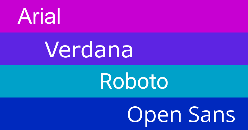
- Arial: Known for its simple, clean lines and excellent legibility, Arial is one of the most frequently used sans-serif fonts. This font works well across different sizes and pixel resolutions, making it a safe choice for digital texts.
- Verdana: Designed especially for digital media, Verdana has wider letter spacing and a bigger x-height (the height of lowercase letters) that enables readability on screens. Its clarity and legibility make it ideal for both body text and headings.
- Helvetica: Another widely recognized sans-serif font, Helvetica, is known for its contemporary, neutral look. Because of its cleanliness, it’s widely used by brands and for interface designs. Whether you’re using mobile apps or websites, Helvetica works well in different digital contexts.
- Roboto: Roboto was developed by Google for Android devices. It is a neo-grotesque font, based on geometric forms with open curves. The reason behind this design is to have high legibility on mobile screens, making it ideal for app designers and developers.
- Open Sans: Open Sans is a humanist sans-serif font designed specifically to offer optimal legibility and readability on screen. With its friendly yet professional feel, it can be applied to different digital content like articles, presentations, or webpages.
Best practices for font selection
When it comes to choosing the right font for digital content, there is more to it than just picking a popular one. Here are some best practices that will ensure that your font selection improves user experience:
Test for accessibility
The choice of a readable font is critical in ensuring that people with visual impairments can read. Consequently, avoid using fonts that will inhibit screen readers from accessing your content.
Consider your audience
The tone and purpose of your content should be reflected in your choice of text. A clean, sans-serif font like Arial or Helvetica would probably appeal more to a professional audience. While a unique, modern looking Roboto might be appreciated by a more creative audience.
Prioritize legibility
Ensure that the font you select is easily readable across all devices and screen sizes. Test how different fonts perform in various contexts and on multiple platforms.
Use a hierarchical font system
To make the reader’s eye glide through your content, you can use a hierarchy of fonts. Headings, subheadings, and body text should have different weights and sizes so as to show its visual structure clearly.
Don’t overuse stylized fonts
Sometimes using fancy-looking texts might seem tempting when you want to highlight your content, but this should not always be done excessively. Too many stylized fonts can make reading harder and negatively affect the overall user experience.
Three case studies of effective font usage
- Google’s use of Roboto: Google’s decision to use Roboto as the Android system font is a prime example of effective font usage. Roboto’s design strikes a balance between modern aesthetics and functional readability, ensuring that content is easy to read across a variety of devices and screen sizes.
- The New York Times and Georgia: The New York Times uses Georgia, a serif font designed specifically for digital screens, for its body text. This choice enhances readability, even in long-form content, and conveys a sense of tradition and authority.
- Apple’s use of San Francisco: Apple’s San Francisco font is a modern, sans-serif typeface designed for maximum legibility on screens. Its use across all Apple devices creates a consistent and cohesive user experience, demonstrating the power of a well-chosen font.
Choose the right font with Yodeck
Although Comic Sans may be useful in informal non-digital contexts, it is obviously inappropriate for digital screens. Wrong font choices could make screen fatigue worse. The Vision Council claims that digital eye strain affects 65% of Americans, and the difficulty of reading poor fonts like Comic Sans contributes to this problem by making text harder to read and increasing cognitive load. Scientific evidence on font readability shows how the right choice of font can enhance user experience, making content more accessible, engaging, and trustworthy.
When choosing fonts for online use, consider other options such as Arial, Verdana, Helvetica, Roboto, and Open Sans. These fonts will not only improve visibility but also add to professionalism and a polished look.
By making informed font choices, designers, marketing managers, and content creators can create more effective and user-friendly digital experiences that resonate with their audience.
Yodeck allows users to easily customize digital signage with a wide range of font options, helping businesses create visually appealing and highly readable displays for any screen size.
