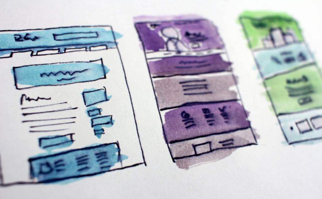
Designing the perfect digital signage layout. It’s a vital part of grabbing customer attention. And giving your business that boost you need to reach the next level of success.
But what goes into designing a great digital signage layout? If you’ve done a quick Google search (and I’m sure all you digital signage junkies already have), it’s kinda overwhelming. Eye movement. Color subtext. Contrast. Composition. Viewer impact factor.
Yikes. Sounds like you need a Fine Arts degree just to get your digital signage layout right, doesn’t it? Not at all! Just follow these back-to-basics guidelines and you’ll be designing snazzy layouts like a pro.
Keep top content center-stage for a great digital signage layout
The whole point of designing a layout is customer engagement. Got a sale going? New mouth-watering menu items being added? Or maybe you’re offering cutting-edge summer school courses? People’s eyes have to immediately zoom to all that must-have info on your screen. Within seconds. Before the next Facebook post or Instagram story lures them away. Otherwise, you won’t be able to translate your digital signage strategy into bottom-line profitability.
So how do you do it?
Make your most important content take center-stage. There are lots of cool studies about eye tracking and how the human eye instinctively scans certain zones within marketing materials first before moving on to the rest. Research published by the National Institutes of Health proved humans focus on the center of the screen first and foremost.
Which makes things super-easy for you. Simply place that playlist with your back-to-school specials or a delicious new digital menu board smack in the center of your layout. Harness human instinct, and it will be impossible for your clients to miss your latest promotion.
Use your brand as a backdrop
Branding is everything, right? That’s why you dabbled in digital signage in the first place. You wanted an affordable, high-tech way to bring your brand to the world around you. And branding has to be a huge part of your digital signage layout design as well. No matter what content you’re keeping in the coveted center-stage spot, you need your brand to be visible. Always.
Make your branding pop by putting your layout’s background zone to good use. Pick an exterior photo of your establishment or a shot of your employees keeping customers happy to use as the backdrop in your layout. Don’t forget 80% of brand recognition gets communicated via brand-specific colors. Those photos you can use as a layout backdrop? Your branding will be everywhere, from the color of employee uniforms to your store décor palette. And the name and logo above the door.
Want to go super low-tech? Just use your logo as a background image. And don’t worry about getting all fancy about it. A simple, static image or photo with your logo or shopfront as a backdrop in your layout means your brand is ever-present without distracting from your showcased content.
And don’t forget it’s a walk in the park to set background zones and layer content in your digital signage layout with Yodeck. Just drag and drop layout zones like a backdrop image or center playlist to prioritize layers.
Declutter, declutter, declutter your digital signage layout
Remember when your mom shouted at you to clean up your room? Well, horror of horrors, the same thing applies to digital signage layout design. Sure, you want that snazzy news app scrolling at the bottom of your layout. And everyone needs up-to-the-minute weather updates, right? Oh, and don’t forget that cool new video you created with a ton of customer testimonials. Gotta have that one too.
Step away from the screen. Right now. Because you’re about to destroy the wow factor you’ve worked so hard to create in your layout.
Less equals more
Especially when it comes to designing an engaging digital signage layout. A simple layout is your friend. Keep only what’s necessary, what’s of real value to your customer. Do you truly need a weather app when what your customers really want to know is the latest happy hour specials? It all depends on your target viewer and the content they find most valuable. What if you’re using your displays for wayfinding digital signage at a conference, and some events are outdoors? Then by all means stick that weather app someplace visible. Because your target viewers need it.
Your customers and target viewers must instantly zoom in on your prime content sitting in the middle of your layout. And you’ve also got to always have your branding backdrop stand out in your digital signage layout. But what if your customers need that time app up in the corner or a ticker crawling across the bottom? Maximize brand and prime content visibility by playing with the app’s font size and color. Yodeck gives you the option of adding some cool text effects like transparency to make sure your brand shines through.
Designing a digital signage layout that engages your customers has never been easier. Stick to our three simple guidelines and your layouts will always impress.
